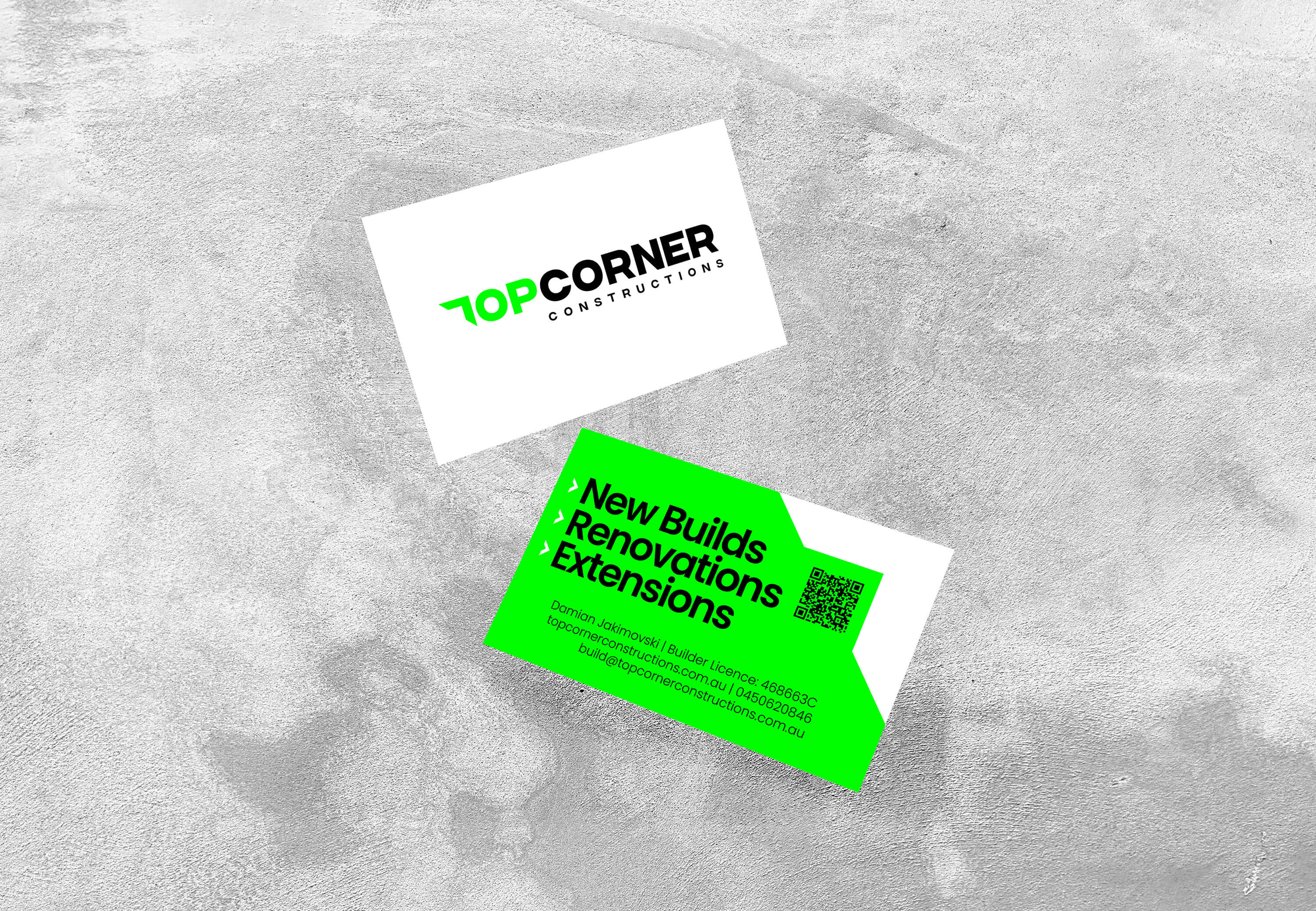
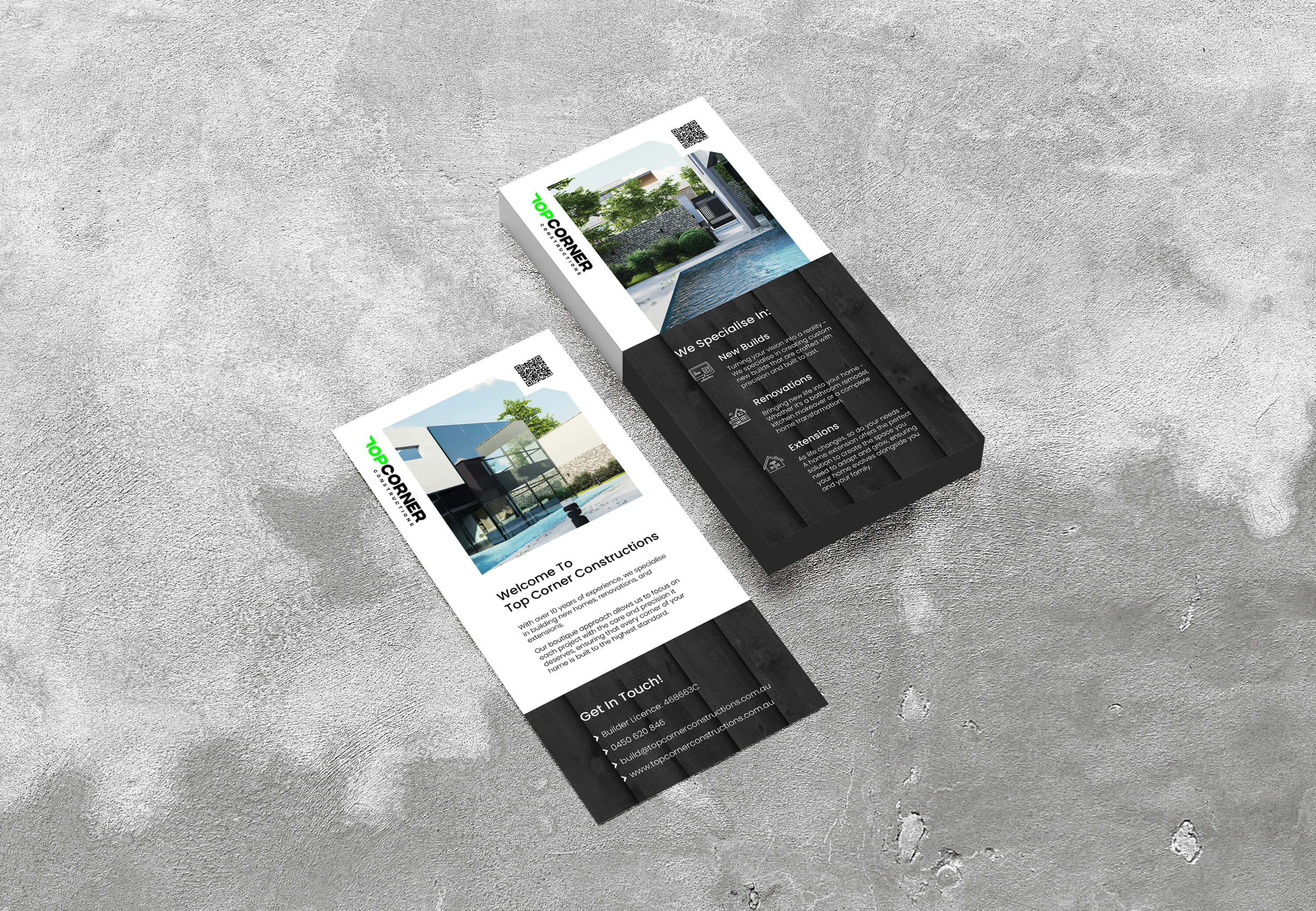
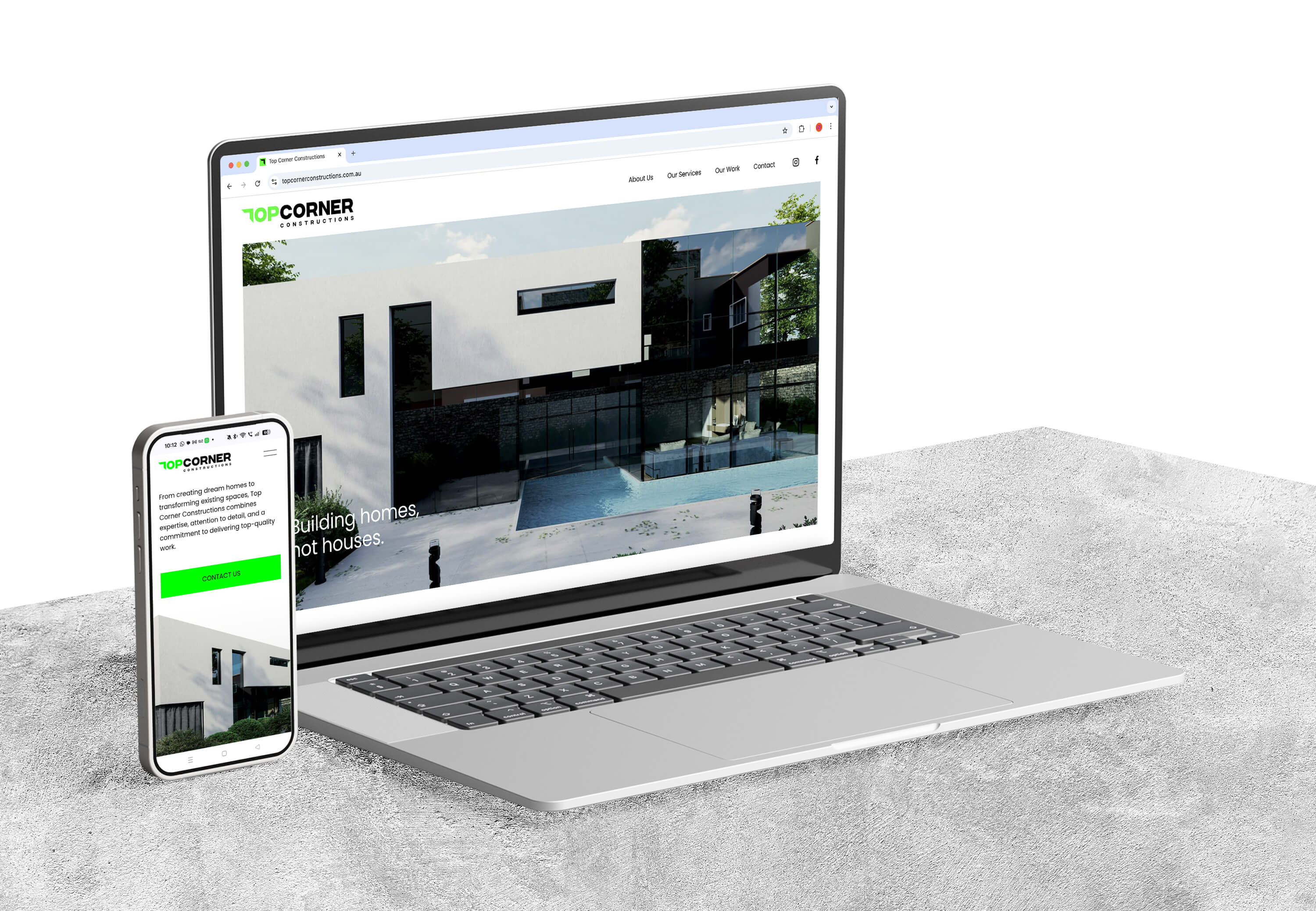
Top Corner Constructions approached me to develop a bold, modern brand with a meaningful edge. Drawing inspiration from the client's passion for soccer, specifically the precision and skill of scoring in the "top corner", the logo centers on a stylized "T". This design cleverly incorporates right angles, evoking both architectural precision and a versatile tool of the trade, the speed square. The green reflects the energy of a soccer pitch and a commitment to safety, while black and white provide a timeless, striking contrast. Beyond the branding, we extended the design across business cards, flyers, a website, and social media assets coming soon.